There are a few things to consider when choosing a background for someone's headshot. What is the skin and hair color? What is their clothing? What feeling do they want to project – Snuggly Teddy Bear or Chuck Norris? Do I need to match a style or color that their company is currently using?
During longer sessions, there’s more time to experiment with different options, but for larger group sessions (20 people and up) we usually have to make a decision and stick with it to keep to a schedule.
Here's a list of the most common background options:
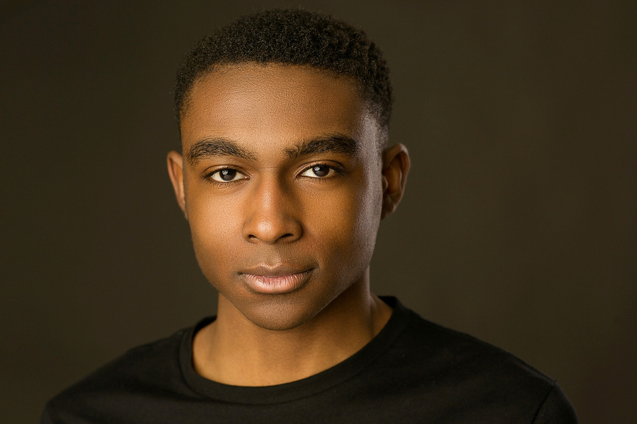
WHITE
A white background is bright, happy and upbeat. It is one of my first choices when shooting a headshot. White also matches any website color scheme and provides good contrast with most clothing.
If you want to add a digital background, it’s also really easy to separate the white out and replace it with something else: solid colors, blurry backgrounds, exploding cars...
Below is an example where I put in a blurry office background.

GREY
Like white, grey also matches everything and provides nice contrast with most hair and skin.
The difference with grey is that it conveys a slightly more serious tone. If you’re a therapist trying to project approachability and friendliness, you may want to go with the white. If you’re a financial expert managing millions of dollars, you may want to go with the grey.
OUT OF FOCUS/CINEMATIC BACKGROUND
This one is getting more popular. Instead of using a photo background, I photograph with a telephoto lens that throws the existing background out-of-focus. It’s amazing how cool your office furniture can look when really blurry.
This works best in larger spaces.

COLORED BACKGROUNDS
These are not my favorite choice. Colored backgrounds can look strange against some clothing and skin tones, and can clash with a website or design color scheme.
Colored backgrounds are also hard to match from one shoot to another. For example, if I use the same blue background paper on two different photo sessions, and the lights are not set up exactly the same way, the blue will look different. If you work for a larger company that is hiring photographers in different states, then the color becomes even harder to match.
If background color consistency is important to you, you may want to shoot against white or grey and then add the background digitally in post.
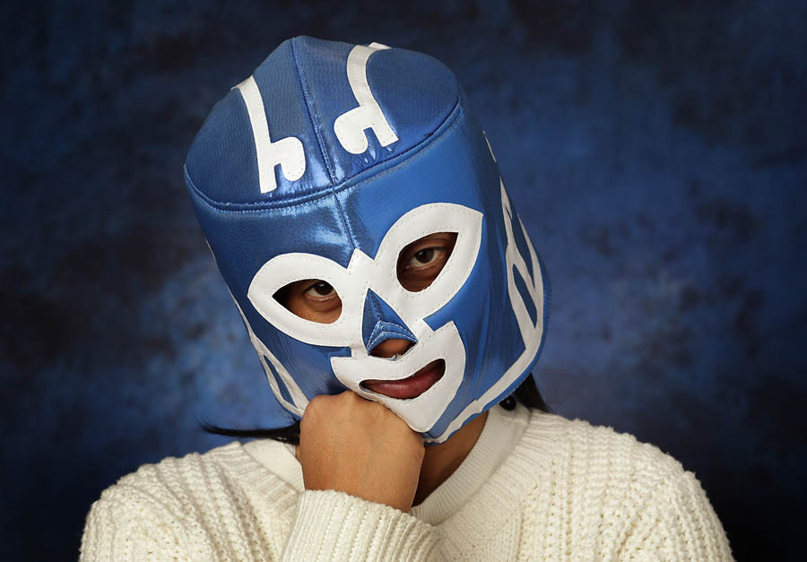
OLD SCHOOL MOTTLED PHOTO BACKGROUND
These are going out of style and I hardly use them. However, some companies have been using these backgrounds for a long time and continue to do so for consistency’s sake, so I do own one (but I hide it so my photographer friends won’t make fun of me).
Below is a photo of Mexican wrestling legend "El Huracan" who is a bit disappointed in my choice of background.